|
I came into this week of my genius hour project knowing that it was going to be the last week of the project. I wanted to create something this week that could show some of the skills I've learned over the 12 weeks but also finish off the project nicely. I wanted to somehow incorporate all of the pictures I had created into one, so I decided to make a collage. I started by importing all of the pictures I've edited over the 12 weeks into one photoshop file. I then masked out the pictures but instead of masking the background out like usual, I left some of the background and used the polygon lasso tool to cut out the pictures I had edited. This created a cut out scrapbook effect that I was looking for. I then added shadows on all of the individual pieces. I then added the picture of the lake I took and added that as the background. To finish the editing off I added the logo I had created week one and put it front and center. This looked really cool but I wanted to show some of the skills I learned with adding effects. I started adding effects by making the picture black and white by using a gradient map. I then found a crumpled paper effect online and put it over the picture. I repeated this and added different creases on different parts of the photo using different source images as effects. I then added a vignette to the picture, making the corners of the picture barely have a black border. Then I added another gradient map to the image to give the collage a light yellow hue. I thought I had created a nice looking collage and I thought it was a cool way to finish off this project. I’ve learned alot about photoshop in the past 12 weeks and I think I'm going to continue to use it and learn more about the software. 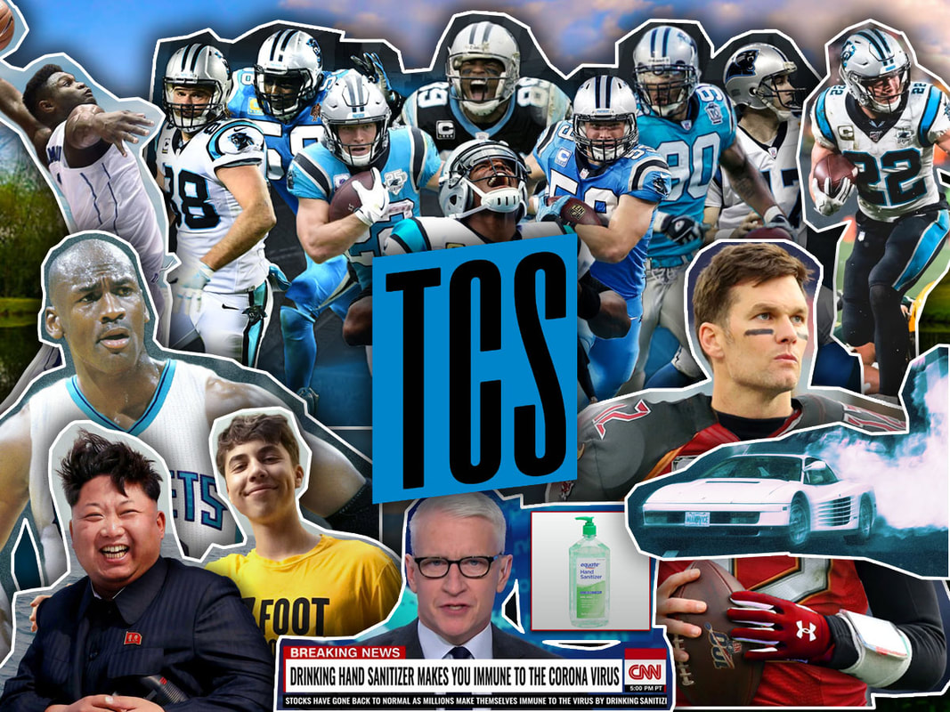 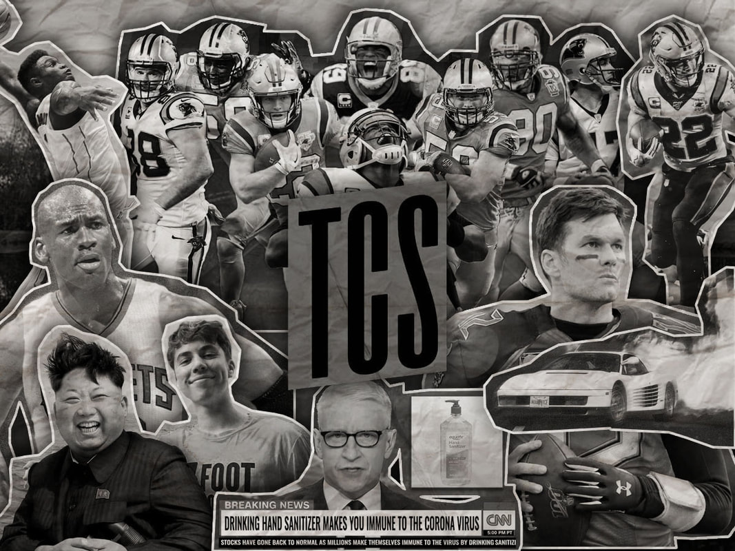
0 Comments
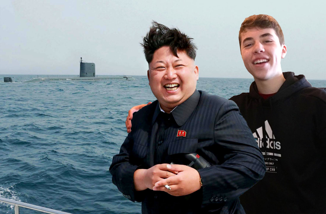
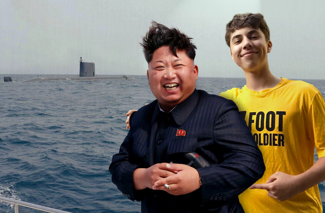
This week I had no idea what to Photoshop. I noticed I had a generic iphone wallpaper and I decided that I wanted to make a new one. The thing is I had no idea what I wanted to put on my lockscreen. I searched around for cool photos that I could use and I found this really cool picture of my favorite football player, Christain McCaffery playing green bay in the snow. I could have just saved the photo and put it as my lockscreen, but when cropped it looked like Christain Mccaffrey was stiff arming the air. I also saw ways I could edit the photo to make it look better and fit in as a lockscreen background, so that's what I did. I started by cropping the image to a 9 by 16 ratio to fit the screen. I wanted to add more space to the top so I could have a place to read the time, but to do this I had to extend the crop of the image outside of the picture, and now a white background was showing. I fixed this by getting a picture of the blurred crowd from outside of the crop and adding it over the white space. I then used the erase tool on a soft setting to blend the new crowd sample with the original picture. I wanted to fix the fact that it looked like McCaffery was stiff arming the air. To do this I masked out the group of players outside of the cropped area. I then moved them to the left closer to McCaffery. To finish the picture I added what's called a viginet. This added a soft black shade around the picture, this adds more focus to the center of the image. After this I used the curves tool to make the lighting on the players less harsh. To only edit the players, I had to mask all of them out. I had created the final product! 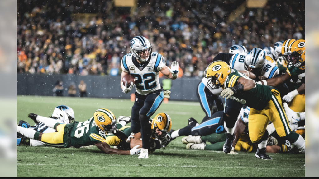 Original Image 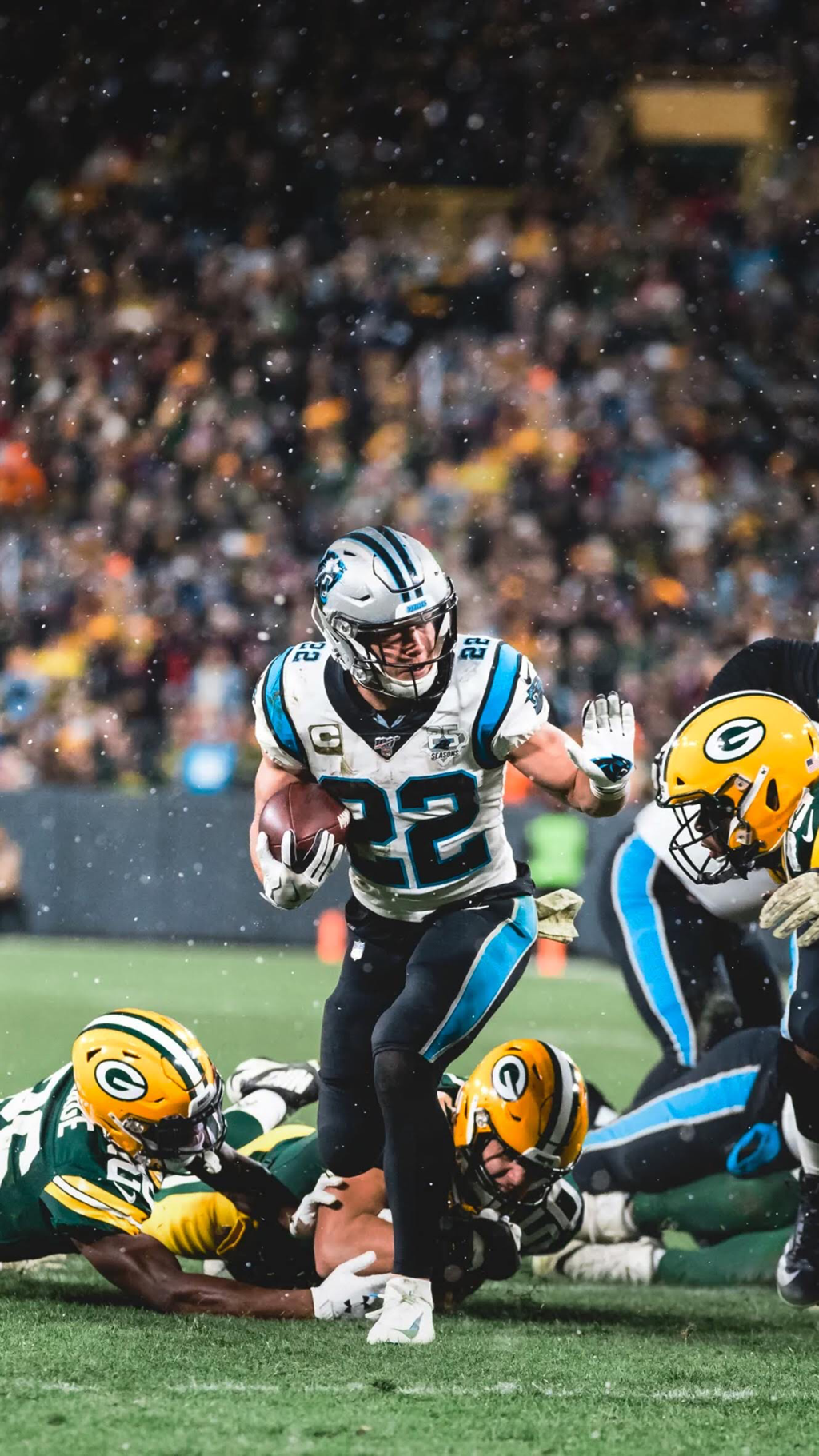 Finished Product For this week’s photoshopped picture I had in mind that this project would be coming to an end soon. Keeping this in mind I needed to remake a photo I created from the start of the project so I could show improvement. With all of the news about Kim Jong-Un I decided to remake the picture of me and him together, but this time my goal was to make things look more believable. I started this task by masking out Kim Jog Un. I then took a new picture of myself with an invisible person. A then masked myself out and added myself behind Kim by moving myself one layer below Kim Jong. I then adjusted my hand to be on Kim’s shoulder. I noticed things didn’t look very believable because my hair didn’t look natural when I masked it. I fixed this by adding a slight brown blur behind my head. I then added a shadow behind Kim. After this I did a lot of lighting work, trying to match where the light was coming from and messing around with the brightness and shadows. I needed to bring the whole picture together and use tools to blend the whole image together. I added a slight spotlight on the picture so the light was coming from one central place in the picture. I felt I had done all I could with lighting. After I was done with the lighting I added a layer of grain on top of everything to try and blend the whole picture together. I then added a gradient map that gave the picture a more colorful, but darker tone. I used the curves tool as a final step to blend the picture. The curves tool allowed me to edit the brightness and contrast of the whole picture at once. I utilized this tool to give the picture less contrast and more brightness. This tool really helped me fit into the picture. I had done all I could and I was satisfied with the product. In my opinion, I think this looks much better than my first attempt at photoshopping myself into a picture with Kim Jong Un.
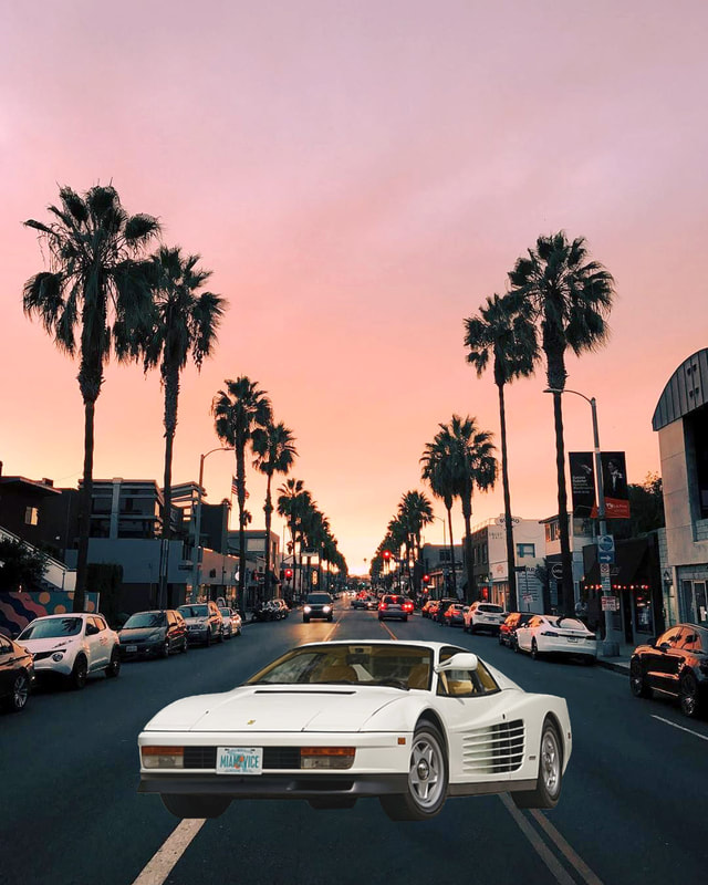
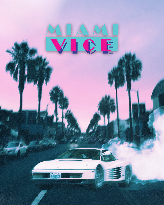
First Attempt, Week 1 Second Attempt, Week 10This week I wanted to do something I hadn’t done before. I was looking to photoshop an image of a car and turn it into some kind of poster. I was scrolling through tik-tok and I saw a video showing wallpapers with an 80’s nostalgia. I had the idea to photoshop a car picture with this kind of nostalgic look. I thought a little bit about 80’s stuff and I decided to photoshop the white Ferarri from the TV show Miami Vice. I started by finding a picture of the car and masking it out. I then looked around and found a cool picture looking down a street in Miami. This looked unnatural and I knew I had a lot of work to do. I started by adding a shadow under the car to start and make things look more natural. I then added a few effects I found online to make the picture look like it was taken by a camera from the ’80s. I then added a tool called gradient map. This effect allows you to choose what colors are replaced with black and what colors are replaced with white. The first time I used this tool on this image was to make the white and black colors stand out more in the image. I then used the filter again but I replaced black with blue and white with pink. I then used the blending tool “Linear Light” and I turned down the opacity of the effect. This gave the poster a pink and blue hue which is what I was looking for. I then added the Miami Vice logo at the top center of the picture. After this, I wanted to stylize the car some more than it already was. I added tire smoke to the back of the car and I added a slight motion blur to the car. I then added another slight motion blur to the background so I could make the car the focus of the poster. I then toyed around for a bit with the lighting and I was done. I really like how this turned out!
Before effects After effects
This week I started by working and trying to enhance my Carolina Panthers themed poster that I have been working on since week 6. I saw that the top of the posters background was mostly black behind the KEEP POUNDING text. I added a skyline image behind the letters and I lightened some things up in the back. I then decided since this poster was focusing on the Panthers Franchise History mine as well include some of the accomplishments they have achieved through out the years and just tie everything together. I started by typing EST. 1995 in the bottom left corner. I then put the old a new NFL logos beside the text. I then wrote 2003 and 2015 (the years they won the NFC division). After this I put the trophies the team one in 2003 and 2015 behind the text. On the bottom right side of the poster I wanted to showcase the panthers old logo and the logo it is currently using. Behind all of the text/logos/trophies I added a shadows. I came to the point where I didn't have anything else I could add to the poster so I put the project on hold and moved on to a new smaller project. 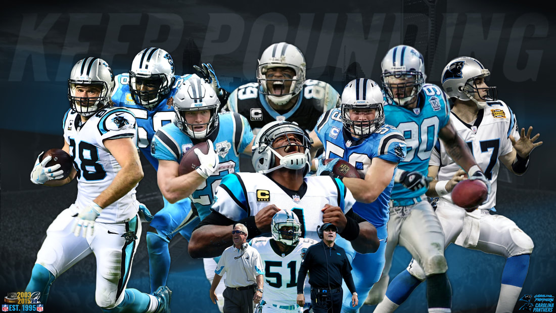 While I was fishing over the break I took a nice picture of the lake. I saw this picture in my camera roll and decided to edit it to make the scenery look better. I played around with a bunch of tools under the Adjustment category. I then used the stamp tool to take a few golfers out of the picture. To finish the picture I made some of the dead grass more green by adding a green tint over the area where the grass was dead. I also messed around and made the moon look bigger. The picture looked so good I added it as my desktop background. 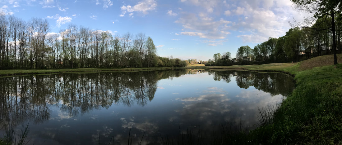 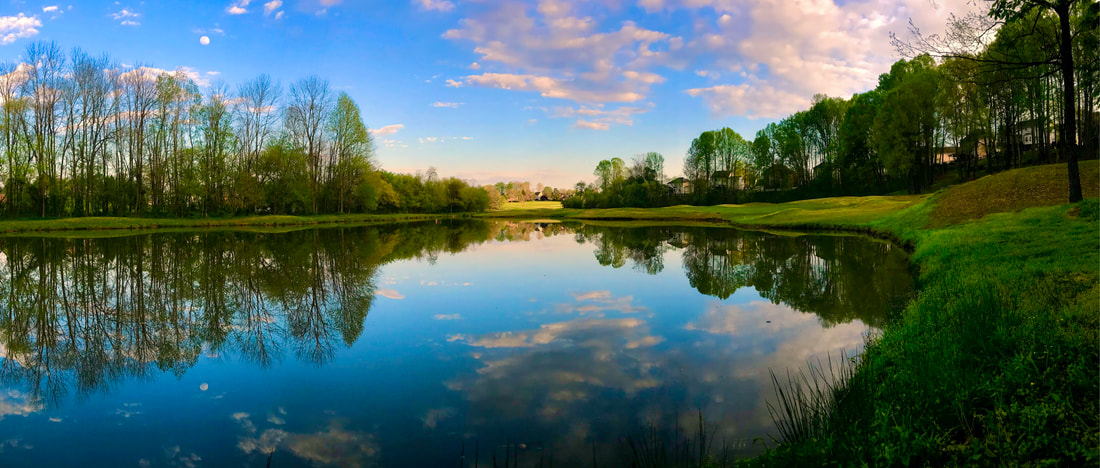 This week I continued to work on my Panthers poster. I first started this week by adding Greg Olsen to the poster covering up Thomas Davis’ cropped out arm. I then added Jake Delhomme to the right side. I added both of these players in by finding pictures of them online that would fit the poster, inserting them in, then erasing the background by using the select and delete tools. I then thought for a little bit on what to add next. I decided to add Sam Mills to the front center of the poster. I then added 2 of the Panthers greatest coaches of all time Ron Rivera and John fox beside Sam Mills. After working to insert these coaches I wanted to stylize the background some more instead of just having a dark background with a faint stadium. I decided to use a stripe found on the Panthers logo to add to the background. I added 2 stripes going across the poster, one on the right side and one on the left. I didn’t want these stripes to be as sharp as they were and I didn’t want them to stand out as much as they were so I decided to change that. I went to the blur category and found the motion blur. I added this motion blur at a high setting to both stripes and I thought it made the stripes look much better and the background looked really clean. I wanted to add one more detail to the background though. I found the Panthers slogan “Keep Pounding” and inserted it faintly to the background. I was trying to figure out small details I could add to the poster. I remembered Thomas Davis won the Walter Payton Man of the Year award so he wore a patch for it, but the picture I used didn’t have that patch. So I found a picture of the patch and added it to Thomas Davis’s shoulder. It didn’t look realistic so I added a shadow on the patch cast by the helmet and I used the perspective tool to fit the patch onto the jersey. I like how the poster looks right now but I want to add more players. I think I will continue working on this poster next week and make it look like a masterpiece. 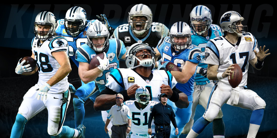 In the middle of week 5 of my project, I came up with a great idea. I wanted to make a big poster of my favorite team, the Carolina Panthers. This poster was going to have all of the great players in franchise history and it would be an epic looking poster that one day I could hang up somewhere in my room. As I was gathering my thoughts on what to do I heard some big news. Tom Brady, the greatest QB of all time, signed with the Tampa Bay Buccaneers. Given that I had just learned how to do a “Jersey Swap” I decided I would do one of Tom Brady in a Buccaneers uniform and I put the Panthers idea on hold. Once I knew what I was going to do I needed to find a base picture of Tom Brady and a picture of the uniform I was going to put on top of him. Once I found both of these pictures I masked out a picture of Josh Mccown so his #12 jersey was the only thing showing. After that, I had a really difficult time trying to fit the Jersey onto Brady even with using the puppet warp tool that I learned how to use in a previous week. I was determined to figure out how to fit the jersey so I had to get creative. I decided to cut out the brown collared shoulder pads and separate them from the original mask. This way I could fit the shoulders correctly using the puppet warp too while leaving everything else alone. I then cut out the orange stripes on the jersey and put the stripes next to the brown shoulder area. I then put the remainder of the red jersey that also had the number and the patches onto Brady. I had one issue though, I couldn’t see Brady’s hands that were holding a football in the original image. I had to then go to the original image and mask out his arms, hands, and the football. On Brady’s left hand he was wearing navy glove and I wanted to change the color of it to red. I didn’t know how to do this but after watching a quick tutorial I learned how to use the hue tool. I then changed the color of the glove from the original image, changing the color of it from patriots navy to a red color. I then added shadows under Brady’s arms and I also gave the football a shadow. I was done. I thought the Jersey swap turned out great! 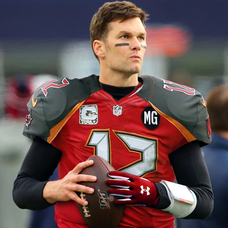 For week 6 I wanted to start on my Panther’s poster that I had put on hold. I knew that what I wanted to accomplish would take a long time if I wanted to do a good job on it so I needed to stay patient. I’ve never worked on something this big so it could take up multiple weeks of my project. I did have a vision in place and got off to a pretty fast start. I started by finding a picture of panthers stadium filled with fans at a game. I put this on a black background and made the stadium picture black and white and turned the opacity down. This made the stadium look dark but that how I wanted it. I then went searching for pictures of some of the great panther’s players in history. I started by finding a cool picture of Steve Smith yelling after a catch. I masked him out and positioned him big and put him in the center. I then found pictures of Christain McCaffery and Luke Kuechly. I masked them out and put them side by side in front of Steve Smith. I then found a picture of Cam Newton doing his superman pose so I masked him out and positioned him upfront and in the center. I then found a picture of Julius Peppers wearing a blue jersey running with the ball. I masked him out and positioned him to the left. I realized I had made the jersey colors match up with corresponding players to the left and right. I wanted to continue this pattern. I then masked and positioned a picture of Thomas Davis about to make a tackle. This picture had one problem though, his hand was cropped out in the picture. This shouldn’t be a huge problem because when I continue this project I’ll just to have to cover this up with another player or something else. I’m proud of what I have done so far and I am excited to continue working on this poster! 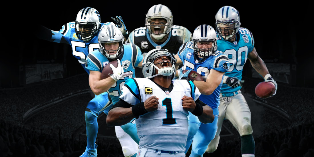 This week I decided to make a fake report about the Carona Virus. A lot of misinformation is being spread so I decided to tag along and make something fake, I just won’t post it out. There was a big debate going on about fake news and it seems like it just keeps reoccurring and I keep seeing more and more fake stuff. I wanted to see how people make these fake reports so I took it into my own hand to experience it first hand. I first had to find a reporter. I found a picture of Anderson Cooper reporting about something that involved Donald Trump. I then had to cover up what the bottom report graphic was originally talking about. To do this I created a new layer and then used the square select tool. I selected the top graphic and filled it with white. I then covered up the scrolling graphic with a black fill. I left where the graphic said breaking news. I then found a font that looked similar to the original news report. I inserted the text and fitted it to look believable. I cut off some of the text on the scrolling graphic to make it look like the text was actually scrolling. I then found a picture of a squirt bottle of hand sanitizer and put it in the top right of the picture. I added a shadow to the picture to stylize the image but the hand sanitizer still felt like it didn’t belong. I tried to make this hand sanitizer look natural but I just couldn’t get it to look right. I was searching around for a solution and saw some effects on the fx toolbar that I had never used before. I decided to use a tool called gradient overlay. I found out quickly that I could use this tool to make a gradient of colors over an image. I decided to make the top white and the bottom black. I then turned the opacity down on the filter and I really liked how it looked. I kept playing around with the tools on the fx toolbar and found a tool called stroke. This allowed me to make an outline on the hand sanitizer image. I chose to make the outline red to fit the rest of the graphic. I then gave the outline a small thickness and then I selected for the outline to be on a “sharp” style. I had successfully made a fake news report. 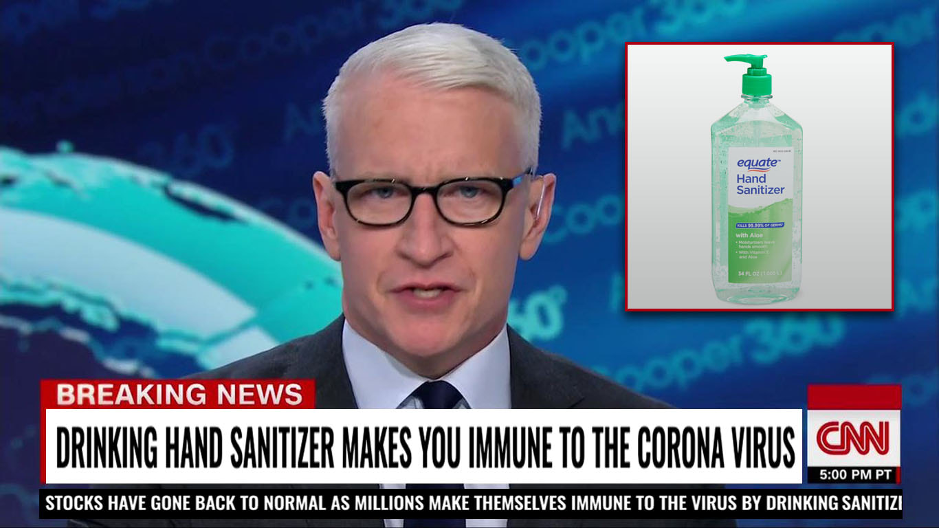 This week when I brainstormed and I decided I wanted to make some type of sports poster design. I was brainstorming for a while and I couldn't think of anything. I scrolled through Instagram and saw Zion Williamson’s Instagram and saw he signed a shoe deal with Jordan. I remembered that Jordans slogan phrase had something to do with fly. I had an idea. I was gonna make Zion Williamson look like he was jumping into the air but at a very high place. I started by finding a base picture of the sky over the clouds. I then found a great picture of Zion jumping, about to dunk. I masked him out, cutting out the background. I then added a motion blur to the left side of his body to make it look like he was moving at a higher speed. I did this by making a duplicate layer of the player and adding a motion blur to the whole thing. I then erased the right side of the layer with a soft brush leaving the left side alone. I then decided to use the soft erase brush again on Zion's feet to make him look like he was coming out of the clouds. I then wanted to add more detail to the poster and make the poster look more stylized. I found a picture of an airplane and put it in the background with a blur. I then did a little lighting work having the light source come from the top right of the poster. I then looked for a camera glare. I found one with some pretty good colors and put it on the poster using the screen opacity tool. I then used the gradient fill tool and put it on a low opacity to emphasize the shadows. I had created a final project that I thought was really cool. I could see this being on an actual poster. 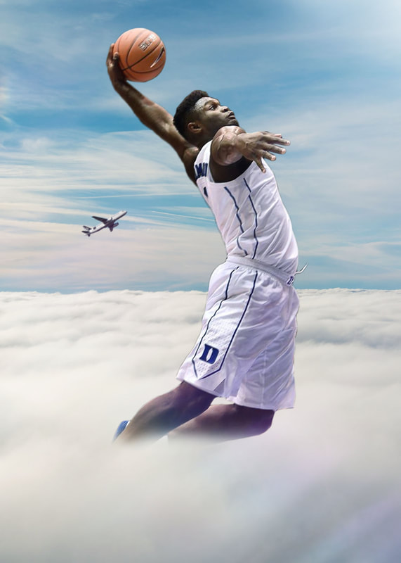 This week I decided to Photoshop Michael Jordan in a Charlotte Hornets jersey to make him look like a player on the hornets. I came up with the idea because I saw an Instagram page that takes popular football and basketball players and changes the picture to look like they have a different uniform on and are on a different team. I decided to do Michael Jordan because he’s the GOAT and he owns the Hornets, So why not make him a player on the team he owns? To start off I found a base image of Michael Jordan on the Chicago Bulls. I then had to find a Hornets uniform at a similar angle as the base Michael Jordan image. I used a picture of Kemba Walker’s uniform to do this. I had trouble fitting the jersey on MJ though. I needed help so I looked up a tutorial on youtube. There were a lot of tutorials titled “jersey swaps” so I guess this must be a popular thing to photoshop. In the tutorial, I learned about the puppet warp tool under the edit tab. This helped me fit the jersey onto MJ using tabs to stretch and manipulate certain areas of the jersey. I then used the stamp tool which I also needed to watch a tutorial on. I got rid of the original 15 on the jersey using the stamp tool. I then searched for a person who wore #23 on the hornets and put that #23 on to MJ. I then did some lighting to make the jersey look like it was creating proper shadows and I was done with the “Jersey Swap”. The picture didn’t look natural though. The original picture of Michael Jordan had fuzz on it due to it being taken on an older camera. I found a tool called “add noise” so I used it on the hornets jersey. This helped the picture look much more natural. I then decided to stylize the image. To do this I added a faint light blue tent in the background and I added a spotlight effect and some lighting along with it. I then used a tool called “Gradient Map” which I used to blend the colors of the picture. I had created a final product that I was satisfied with and proud of. All in all, I learned 3 new tools which were called the puppet wrap, stamp, and add noise. I also learned about how to make a Jersey Swap and I learned more about how sports images can be edited which is very interesting to me. I definitely want to do more with sports pictures as I keep making Photoshopped images for my project. Here is the original picture and the finished product of this week’s edit:
|